
I attended an excellent Insurance Institute of London lecture recently “Accelerated learning and memory techniques” given by Rob Murray of Lane, Clark & Peacock. Cii members can check the out the podcast.
Rob talked about how imagery helps us remember things, which is very useful for the CII’s multiple choice examinations. In this article though I want to tell you about how can help make our Advanced Diploma coursework written assignments stand out and score higher marks easily by including pictures, tables and diagrams.
Any one embarking on their Advanced Diploma assignments should read the CII Coursework assessment tips and be aware of the marking scheme.
You will see that 50% of the mark is for analysis 10% for logical structure.
It also states that you need to produce an assignment that you would be
“happy to give to senior management within your company”
This assignment looks like a school essay:

Whilst this one contains the same content but will score more highly both for analysis and logical structure and is beginning to look like a senior management report.

But there are also pros and cons to spending the time to making your advanced diploma assignment look like a management report.

So how can you make your assignment look more like a business report quickly and easily?
- Use bullets, sub heading and short paragraphs – easy enough
- Use tables - great analytical comparison tools – again easy
- Finally if appropriate add a few charts – take more time to plan and execute
If you are like me and don’t think visually and are struggling for chart ideas then here are a few sources I use which may save you time.
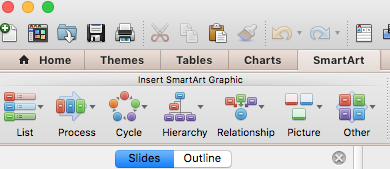
- Powerpoint SmartArt
For those of you familiar with Powerpoint the SmartArt feature will turn a bulleted list in quickly in to various graphics – not brilliant but quick and easy.
- diagrammer.com
Nancy Duarte has taught some of the great presenters how to present more visually and at www.diagrammer.com you can download different diagrams in Powerpoint quickly and easily.
- Andrew Abela’s Diagram Chooser
There is a big debate in the data visualisation world about the usefulness Dr. Abela’s data visualisation chart chooser but his slide chooser here has some great ideas for different charts.
http://extremepresentation.typepad.com/.a/6a00d8341bfd2e53ef01b8d0bfb4ec970c-pi
Do you have any tips you would share with other candidates?
Neil